


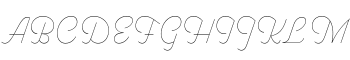
Pret A Porter Contrast Thin
2.81/5
431 votes, rated based on results identification
Publisher
FontBros
License
Commercial
Date added
May 20 2020
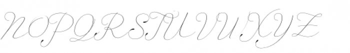
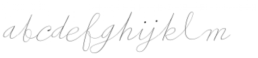
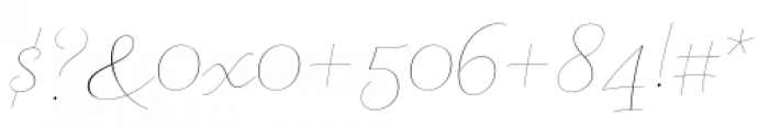
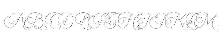
Elegant, high-contrast thin script font. This is an elegant, thin script font with a high contrast between thick and thin strokes. It features flowing, cursive letterforms that convey a sense of sophistication and style.
Ideal for wedding invitations, luxury branding, and elegant stationery.
Logos, Invitations, Branding
Balanced
Download Pret A Porter Contrast Thin font. Pret A Porter Contrast Thin by
See the font with your own text
Category
Script
Italic
Yes
Width
Normal
Line height
Tall
Overall style
Elegant
Cap height
High
Bold
No
Weight
Light
Character spacing
Normal
Contrast
High
X height
Medium
Proposed projects
Ideal for wedding invitations, luxury branding, and elegant stationery.
Use case
Logos, Invitations, Branding
Ascender descender ratio
Balanced
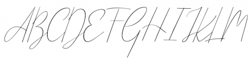
Similar Free Fonts for Pret A Porter Contrast Thin

Similar Fonts for Pret A Porter Contrast Thin from Adobe.com

Similar Fonts for Pret A Porter Contrast Thin from MyFonts.com
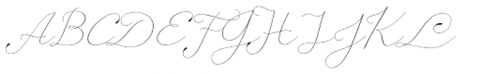

Similar Fonts for Pret A Porter Contrast Thin from CreativeMarket.com


Did you know? We have indexed 99% of the world's fonts!