


The Better Man-Inverse
3.13/5
15 votes, rated based on results identification
Publisher
from Creative Fabrica
License
Commercial
Date added
Feb 14 2024
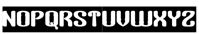
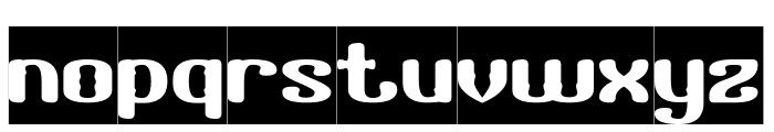
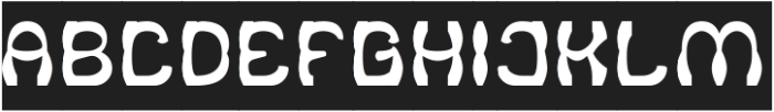
A bold, rounded font with a playful retro style. This font features bold, rounded characters with a playful and retro aesthetic. The letters have a unique, bubbly appearance with consistent stroke thickness, creating a cohesive and eye-catching design.
Ideal for vintage-themed posters, playful branding, and eye-catching headlines.
Headlines, Logos
Balanced
Download The Better Man-Inverse font. The Better Man-Inverse by weknow ? (weknow.deviantart.com). 2013. All Rights Reserved
See the font with your own text
Category
Decorative/Display
Italic
No
Width
Normal
Line height
Normal
Overall style
Retro
Cap height
High
Bold
Yes
Weight
Bold
Character spacing
Normal
Contrast
Low
X height
Medium
Proposed projects
Ideal for vintage-themed posters, playful branding, and eye-catching headlines.
Use case
Headlines, Logos
Ascender descender ratio
Balanced
Similar Free Fonts for The Better Man-Inverse

Similar Fonts for The Better Man-Inverse from Adobe.com

Similar Fonts for The Better Man-Inverse from MyFonts.com

Similar Fonts for The Better Man-Inverse from CreativeMarket.com

Did you know? We have indexed 99% of the world's fonts!