

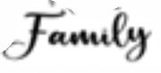
My Empire Wont Fall Regular
2.98/5
2046 votes, rated based on results identification
Publisher
from Creative Fabrica
License
Commercial
Date added
Apr 25 2020
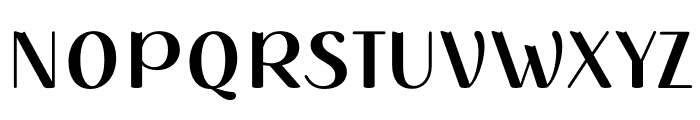
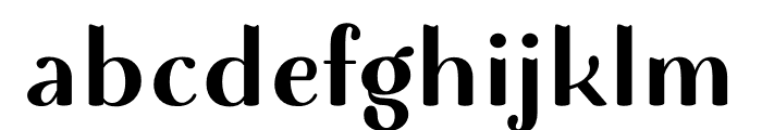
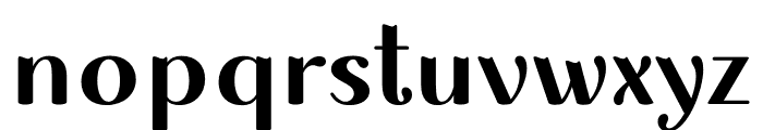
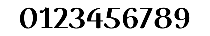
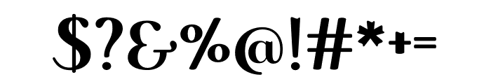
A bold, playful font with a mix of sharp and rounded edges. This font features a bold and playful style with a mix of sharp and rounded edges. The uppercase letters have a strong presence, while the lowercase letters maintain a consistent flow. The numerals are distinct and easy to read, and the special characters add a whimsical touch.
Ideal for posters, branding, and playful graphic design projects.
Headlines, Logos, Posters
Balanced
Download My Empire Wont Fall Regular font. My Empire Wont Fall Regular by Copyright ? 2020 by Misti's Fonts. All rights reserved.
See the font with your own text
Category
Decorative/Display
Italic
No
Width
Normal
Line height
Normal
Overall style
Playful, Modern
Cap height
High
Bold
Yes
Weight
Bold
Character spacing
Normal
Contrast
Medium
X height
Medium
Proposed projects
Ideal for posters, branding, and playful graphic design projects.
Use case
Headlines, Logos, Posters
Ascender descender ratio
Balanced
Similar Free Fonts for My Empire Wont Fall Regular


Similar Fonts for My Empire Wont Fall Regular from Adobe.com


Similar Fonts for My Empire Wont Fall Regular from MyFonts.com


Similar Fonts for My Empire Wont Fall Regular from CreativeMarket.com


Did you know? We have indexed 99% of the world's fonts!