


HIGH CONSEQUENCES-Inverse
2.86/5
21 votes, rated based on results identification
Publisher
from Creative Fabrica
License
Commercial
Date added
Feb 14 2024
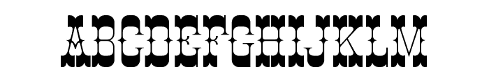
Bold, angular, and geometric with high contrast. This font features bold, angular characters with a distinct geometric style. The letters are tightly spaced with high contrast between thick and thin strokes, giving it a striking and modern appearance.
Ideal for posters, headlines, and branding projects that require a bold statement.
Headlines, Logos
Balanced
Download HIGH CONSEQUENCES-Inverse font. HIGH CONSEQUENCES-Inverse by weknow ? (weknow.deviantart.com). 2013. All Rights Reserved
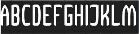
See the font with your own text
Category
Decorative/Display
Italic
No
Width
Normal
Line height
Short
Overall style
Modern
Cap height
High
Bold
Yes
Weight
Bold
Character spacing
Tight
Contrast
High
X height
Medium
Proposed projects
Ideal for posters, headlines, and branding projects that require a bold statement.
Use case
Headlines, Logos
Ascender descender ratio
Balanced
Similar Free Fonts for HIGH CONSEQUENCES-Inverse


Similar Fonts for HIGH CONSEQUENCES-Inverse from Adobe.com

Similar Fonts for HIGH CONSEQUENCES-Inverse from MyFonts.com


Similar Fonts for HIGH CONSEQUENCES-Inverse from CreativeMarket.com

Our latest blog articles
Latest from the forum

Did you know? We have indexed 99% of the world's fonts!