


Getting Hope Thin
3.25/5
172 votes, rated based on results identification
Publisher
from Creative Fabrica
License
Commercial
Date added
Mar 20 2024
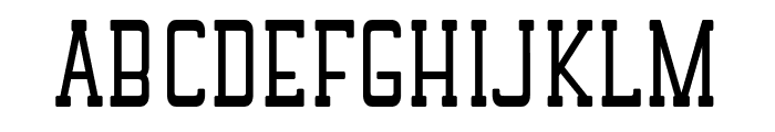
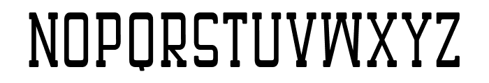
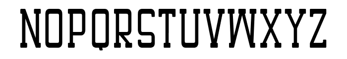
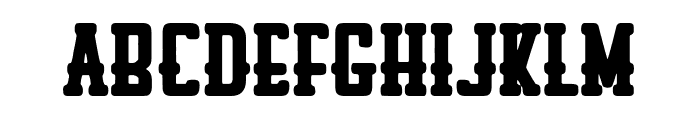
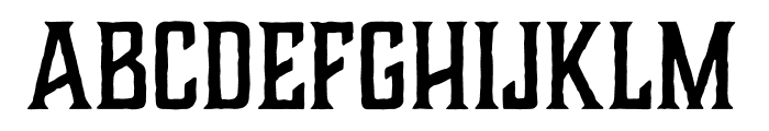
A bold, geometric font with uniform strokes and squared edges. This font features a bold, geometric design with uniform stroke widths and squared-off edges, giving it a modern and structured appearance. The characters are tall and narrow, with a consistent height across both uppercase and lowercase letters.
Ideal for headlines, posters, and branding projects that require a modern and impactful look.
Headlines, Logos
Balanced
Download Getting Hope Thin font. Getting Hope Thin by Getting Hope ? ( 7NTypes ). 2024. All Rights Reserved
See the font with your own text
Category
Slab Serif
Italic
No
Width
Condensed
Line height
Tall
Overall style
Modern
Cap height
High
Bold
Yes
Weight
Bold
Character spacing
Normal
Contrast
Low
X height
Medium
Proposed projects
Ideal for headlines, posters, and branding projects that require a modern and impactful look.
Use case
Headlines, Logos
Ascender descender ratio
Balanced
Similar Free Fonts for Getting Hope Thin

Similar Fonts for Getting Hope Thin from Adobe.com

Similar Fonts for Getting Hope Thin from MyFonts.com
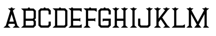

Similar Fonts for Getting Hope Thin from CreativeMarket.com


Our latest blog articles
Latest from the forum

Did you know? We have indexed 99% of the world's fonts!