


Balancing
Publisher
from Creative Fabrica
License
Commercial
Date added
Oct 30 2024
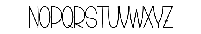
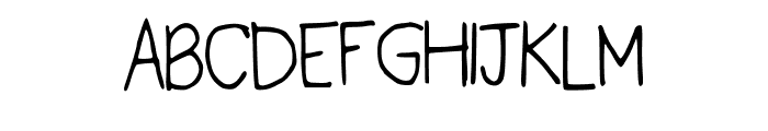
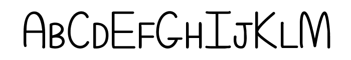
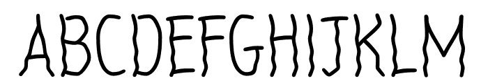
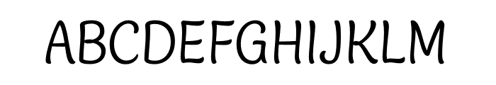
A playful, narrow font with consistent stroke width. This font features a playful and whimsical style with elongated, narrow characters. The strokes are consistent in width, giving it a clean and modern look. The uppercase letters are slightly taller than the lowercase, with a unique flair in the curves and terminals.
Ideal for children's books, playful branding, and creative posters.
Headlines, Logos
Balanced
Download Balancing font. Balancing by
See the font with your own text
Category
Decorative/Display
Italic
No
Width
Condensed
Line height
Tall
Overall style
Playful
Cap height
High
Bold
No
Weight
Regular
Character spacing
Normal
Contrast
Low
X height
Medium
Proposed projects
Ideal for children's books, playful branding, and creative posters.
Use case
Headlines, Logos
Ascender descender ratio
Balanced
Similar Free Fonts for Balancing
Similar Fonts for Balancing from Adobe.com
Similar Fonts for Balancing from MyFonts.com


Similar Fonts for Balancing from CreativeMarket.com


Did you know? We have indexed 99% of the world's fonts!