


Tale Forty
2.87/5
461 votes, rated based on results identification
Publisher
Myfonts.com
License
Commercial
Date added
Nov 28 2016
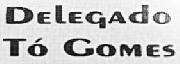
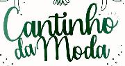
A tall, narrow, vintage-style font with consistent stroke width. This font features tall, narrow characters with a distinct, vintage style. The strokes are consistent in width, giving it a monospaced appearance. The uppercase letters are particularly elongated, while the lowercase letters maintain a more traditional height. The numerals and special characters follow the same narrow and tall design, contributing to a cohesive look.
Ideal for vintage-themed posters, book covers, and branding projects that require a classic touch.
Headlines, Logos
High
Download Tale Forty font.
See the font with your own text
Category
Decorative/Display
Italic
No
Width
Condensed
Line height
Tall
Overall style
Vintage
Cap height
High
Bold
No
Weight
Regular
Character spacing
Normal
Contrast
Low
X height
Medium
Proposed projects
Ideal for vintage-themed posters, book covers, and branding projects that require a classic touch.
Use case
Headlines, Logos
Ascender descender ratio
High
Similar Free Fonts for Tale Forty


Similar Fonts for Tale Forty from Adobe.com


Similar Fonts for Tale Forty from MyFonts.com

Similar Fonts for Tale Forty from CreativeMarket.com


Did you know? We have indexed 99% of the world's fonts!