


Arecibo Too
3.02/5
1144 votes, rated based on results identification
Publisher
Myfonts.com
License
Commercial
Date added
Nov 26 2016
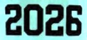
A bold, decorative font with vintage flair and intricate inline detailing. This font features a bold, decorative style with a strong vertical emphasis and intricate inline detailing. The characters are tall and narrow, with a distinct vintage flair, reminiscent of old signage or posters. The uppercase and lowercase letters maintain a consistent style, and the numerals and special characters are equally ornate.
Ideal for vintage-themed posters, signage, branding, and headlines.
Headlines, Logos, Posters
Balanced
Download Arecibo Too font.
See the font with your own text
Category
Decorative/Display
Italic
No
Width
Condensed
Line height
Tall
Overall style
Vintage
Cap height
High
Bold
Yes
Weight
Bold
Character spacing
Normal
Contrast
High
X height
Medium
Proposed projects
Ideal for vintage-themed posters, signage, branding, and headlines.
Use case
Headlines, Logos, Posters
Ascender descender ratio
Balanced
Similar Free Fonts for Arecibo Too


Similar Fonts for Arecibo Too from Adobe.com


Similar Fonts for Arecibo Too from MyFonts.com

Similar Fonts for Arecibo Too from CreativeMarket.com


Did you know? We have indexed 99% of the world's fonts!