

SlabStruct Too Regular
2.88/5
1401 votes, rated based on results identification
Publisher
License
Free for personal use
Date added
Jan 10 2017
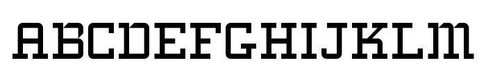
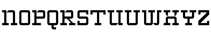
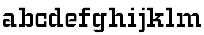
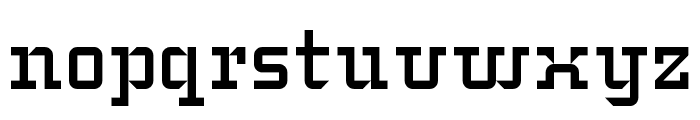
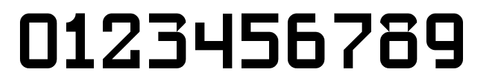
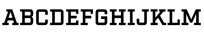
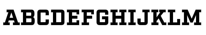
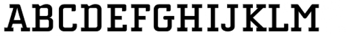
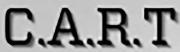
A bold, geometric slab serif font with a mechanical and structured design. This font features a bold, structured slab serif design with geometric elements. The characters are uniform and have a mechanical feel, with consistent stroke widths and sharp angles. The uppercase letters are blocky and robust, while the lowercase letters maintain the same structured appearance. Numerals are equally bold and clear, making them highly legible.
Ideal for headlines, posters, branding, and any project requiring a strong, industrial aesthetic.
Headlines, Logos
Balanced
Download SlabStruct Too Regular font. SlabStruct Too Regular by Copyright paul hunt 2008
See the font with your own text
Category
Slab Serif
Italic
No
Width
Normal
Line height
Normal
Overall style
Modern
Cap height
High
Bold
Yes
Weight
Bold
Character spacing
Normal
Contrast
Low
X height
Medium
Proposed projects
Ideal for headlines, posters, branding, and any project requiring a strong, industrial aesthetic.
Use case
Headlines, Logos
Ascender descender ratio
Balanced
Similar Free Fonts for SlabStruct Too Regular
SlabStruct Too Regular
Free for personal use
Typo College LC Demo
Free for personal use

Similar Fonts for SlabStruct Too Regular from Adobe.com
Factoria Demi
$ Commercial > Adobe.com
Factoria Bold
$ Commercial > Adobe.com
Similar Fonts for SlabStruct Too Regular from MyFonts.com
Cholla Slab Bold
$ Commercial > MyFonts.com
Factoria Demi
$ Commercial > MyFonts.com

Similar Fonts for SlabStruct Too Regular from CreativeMarket.com
Factoria Demi otf (400)
$ Commercial > CreativeMarket.com

Factoria Bold otf (700)
$ Commercial > CreativeMarket.com


Did you know? We have indexed 99% of the world's fonts!